High-Velocity Onboarding Optimization
ROLE
Lead Product Designer and Manager
TEAM
Head of Product, Product Manager, Engineers, Finance, CEO
COMPANY
Dash.fi
RESPONSABILITIES
Lead product strategy, UX/UI design, research, problem-solving, and cross-functional collaboration
1. Introduction
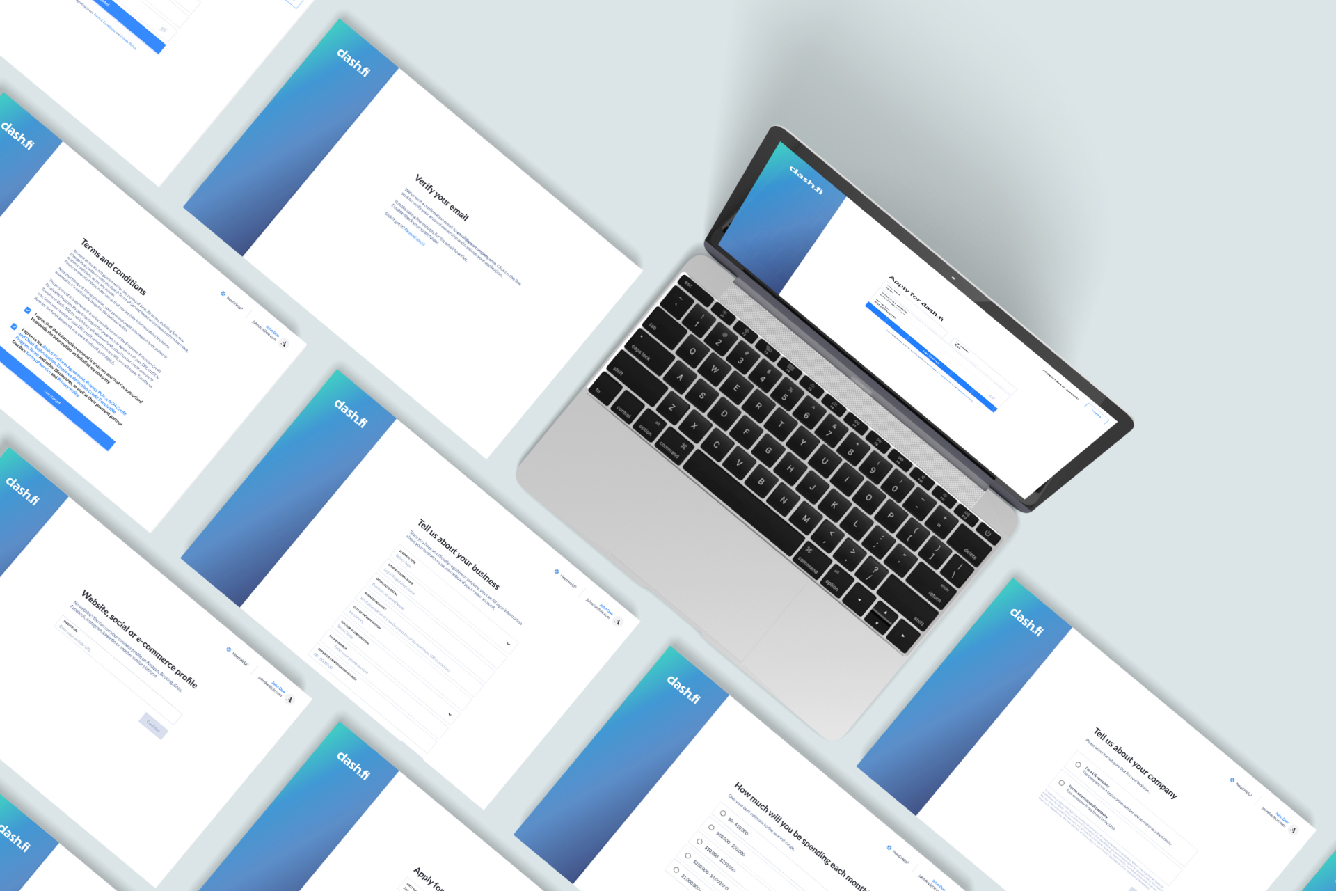
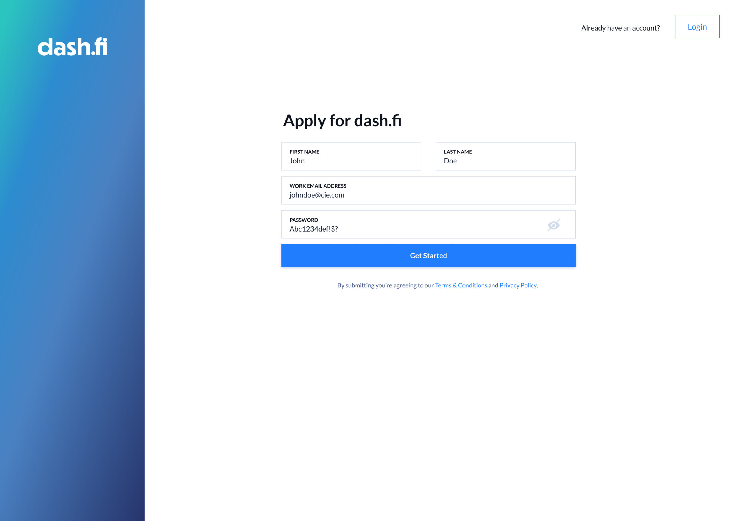
Dash.fi provides high-limit charge cards specifically for digitally native businesses managing massive advertising budgets. In the hyper-competitive fintech landscape, the first 60 seconds of a user’s experience are the most critical for conversion. As the Lead Product Designer, I was tasked with re-engineering the onboarding flow to eliminate the friction of setting up new accounts. My goal was to take a complex, regulatory-heavy process and transform it into a seamless, sub-one-minute entry point that establishes trust and security immediately.
2. Problem & Business Context
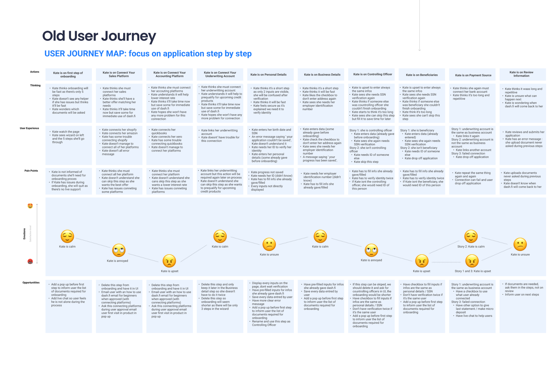
The business faced a major acquisition hurdle: 40% of users abandoned the onboarding process because it was perceived as too long or complex. From a product management standpoint, we had to balance several conflicting challenges: meeting strict KYC/KYB regulations, mitigating fraud, and identifying centralizing officers and beneficiaries—all while drastically shortening the "time-to-account." The core mission was to achieve the Lowest Onboarding Friction Index possible without compromising the high-security standards required for a financial product.
3. Research & Insights
Our discovery phase utilized Google Analytics, competitive benchmarks, and direct user interviews to quantify exactly where the funnel was leaking.
The "Support Gap": We discovered that 80% of support issues were preventable. They were caused by a lack of clear placeholders and helpful error messaging, leaving users feeling "stuck" and forcing them to abandon the app to seek help.
Competitive Analysis: We analyzed Ramp and Revolut. While Ramp excelled at interactive walkthroughs, Revolut’s ultra-short flow served as a warning: their lack of human support during technical bugs led to high user frustration.
Velocity as a Metric: Our data showed that a 70% decrease in average onboarding time was the necessary threshold to move the needle on application completion and increase approved applications by 30%.
4. Design Strategy & Prioritization
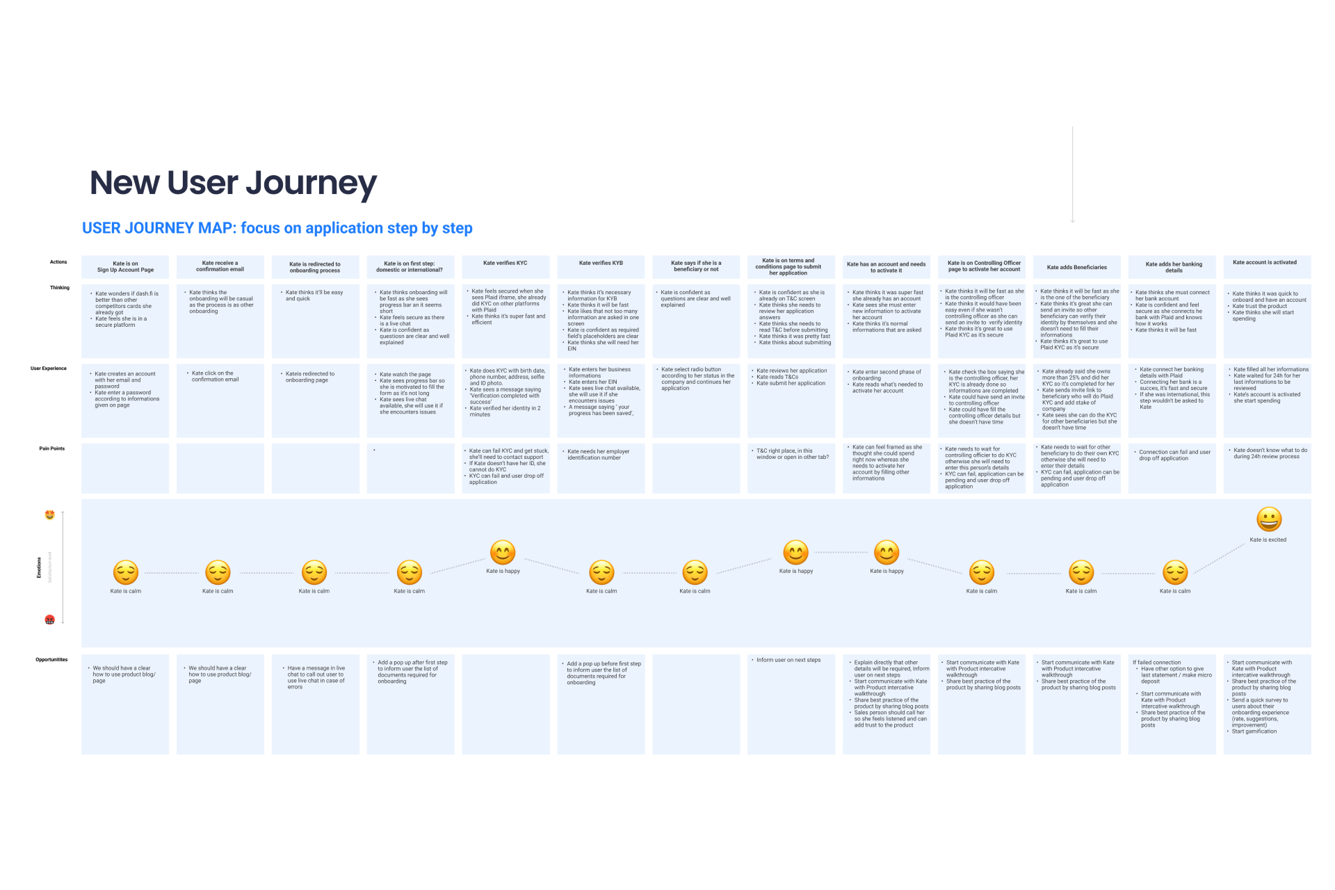
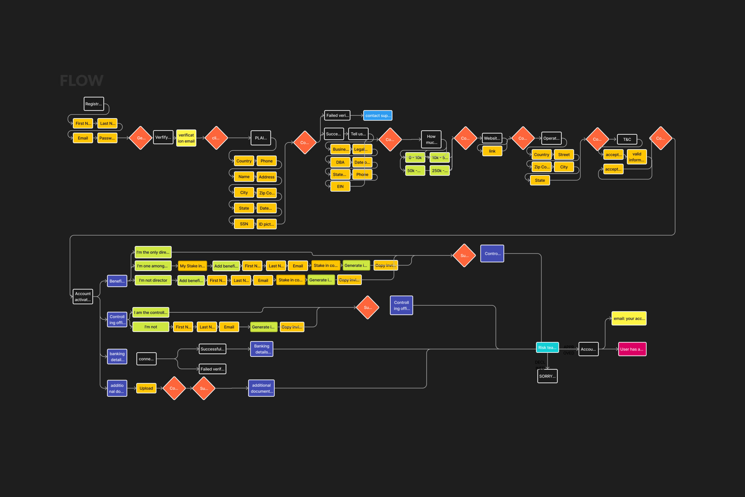
To manage the complexity of the "Zero to One" build, I used the Eisenhower Matrix to prioritize design efforts, moving away from a "one-size-fits-all" form to a logic-based journey.
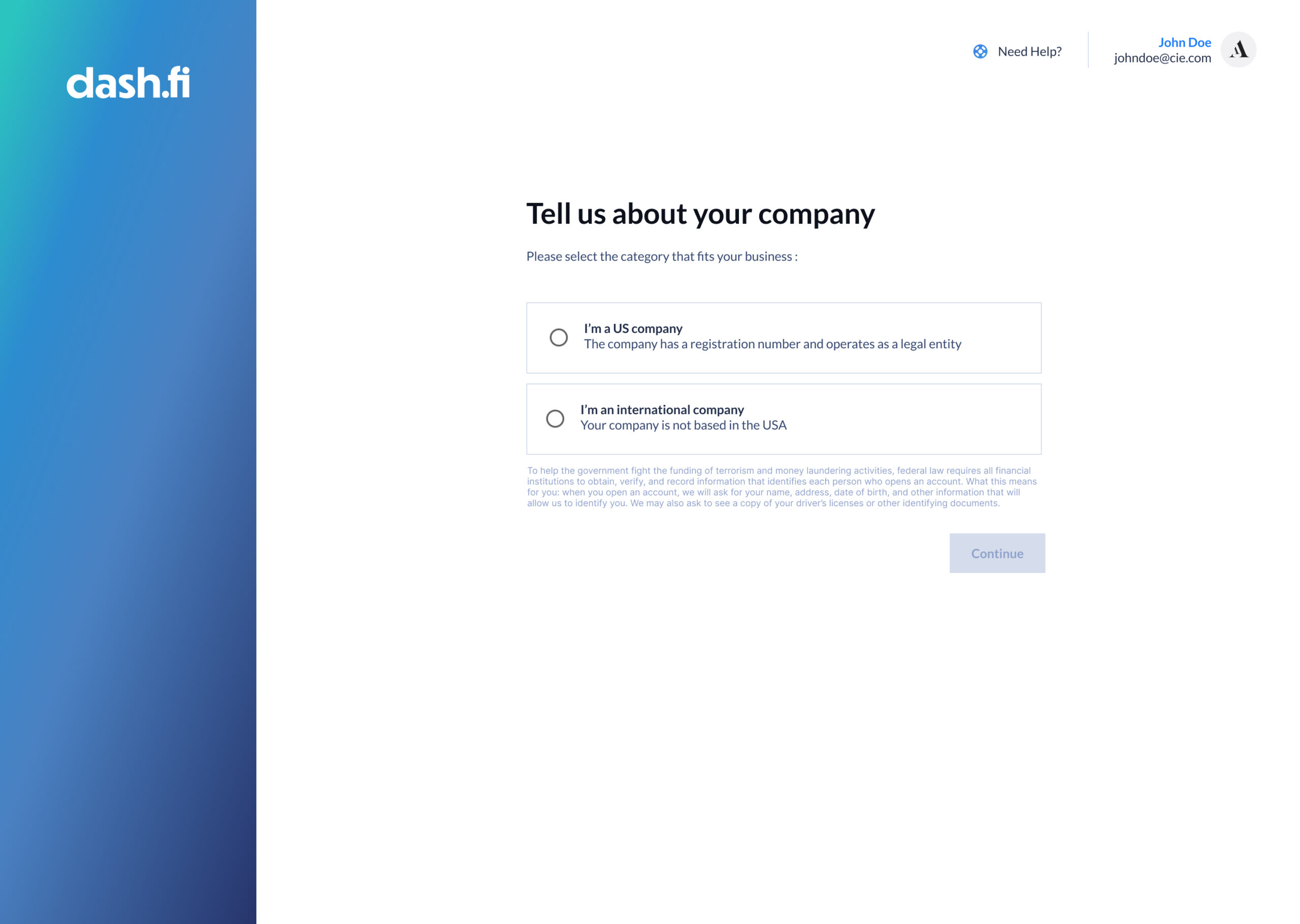
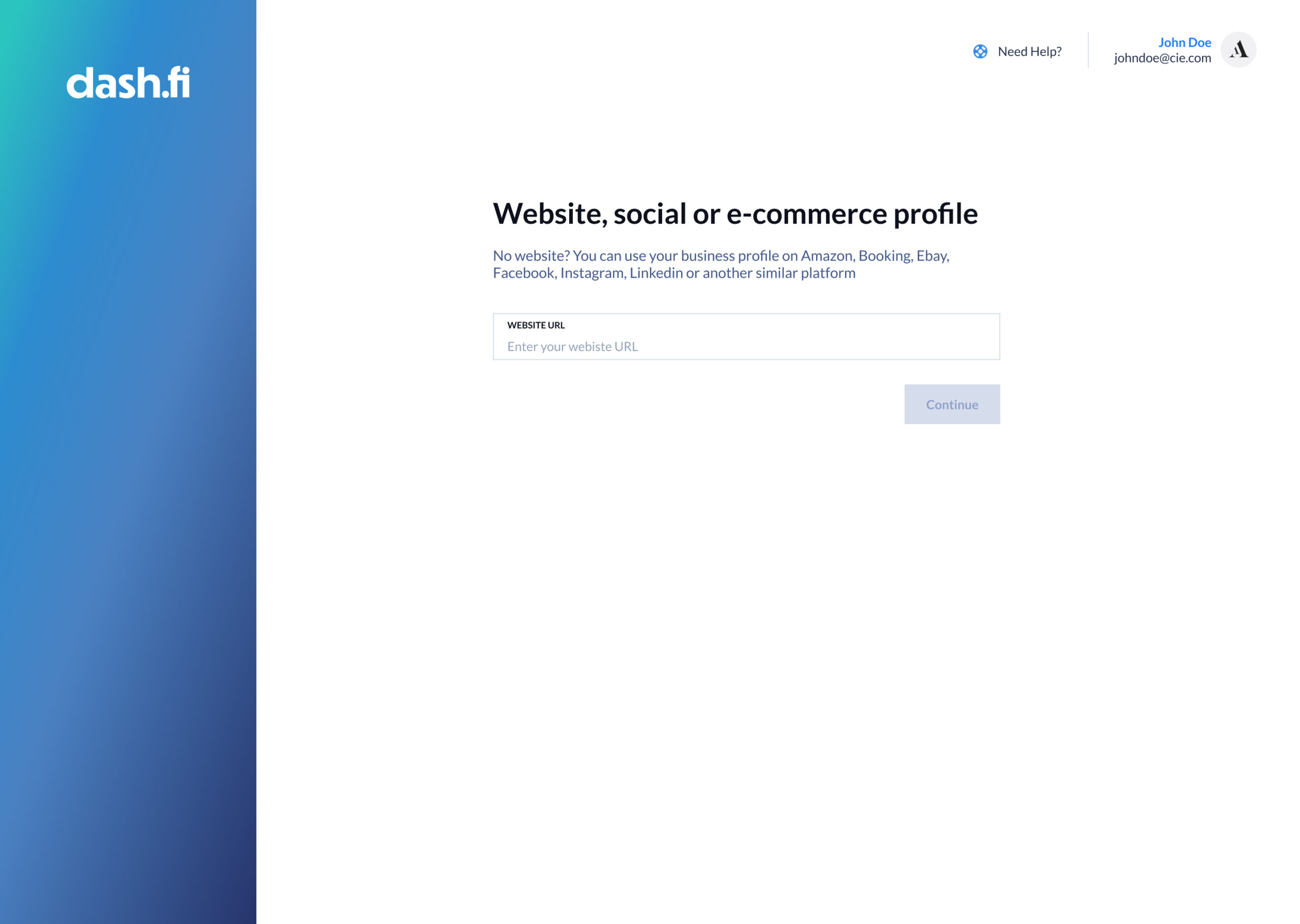
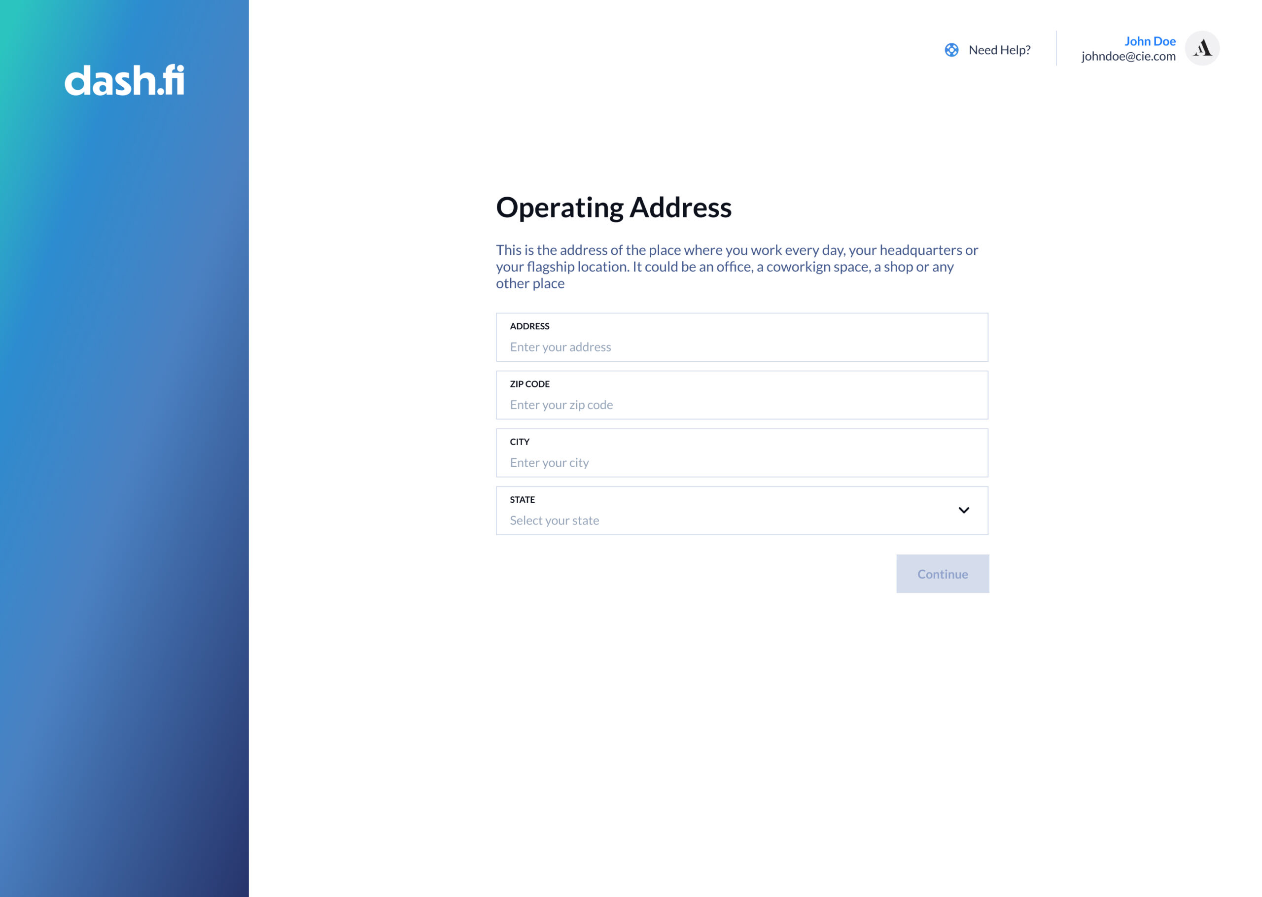
Smart Routing Architecture: I designed a system that identifies Domestic vs. International users at the very first step. This ensures users are only prompted for the specific documentation they need, preventing the cognitive overload and "form fatigue" that caused previous drop-offs.
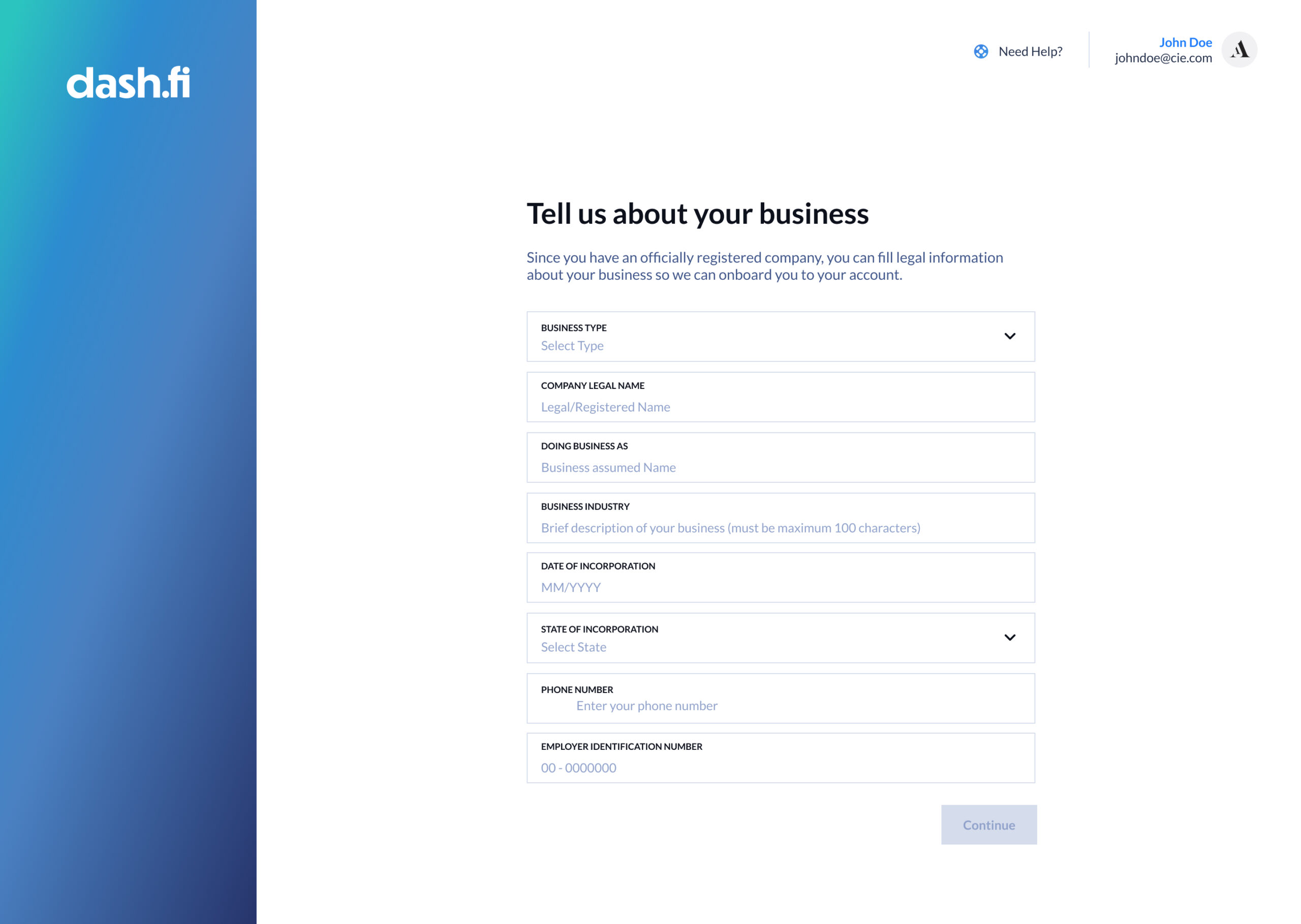
Designing for Failure (Placeholders & Microcopy): Knowing that 80% of support tickets came from user error, I revamped the data-entry UX. We implemented Contextual Placeholders that show users exactly what data is needed (e.g., specific EIN formats) before they type, rather than waiting for them to fail.
Always-Available Support: Learning from Revolut’s mistakes, I ensured that a Human-in-the-Loop support trigger was always accessible. If a user spends too much time on a single field, the system proactively offers assistance, ensuring no user is left "stuck."

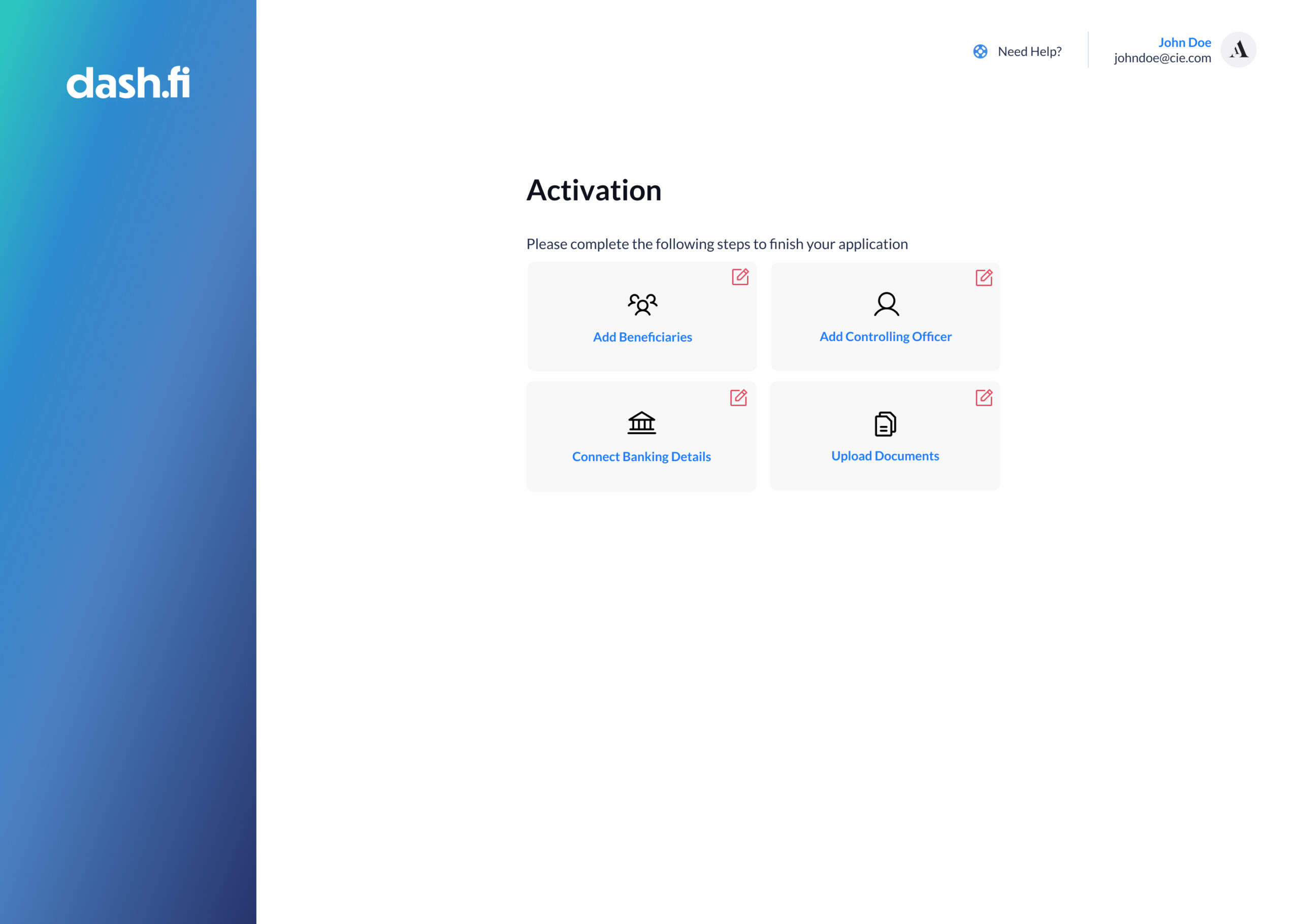
5. Solution: High-Velocity Verification
The final solution was a streamlined onboarding engine optimized for speed, clarity, and user confidence:
UI Precision & Error Handling: We moved from "passive" error messages to "active" guidance. If a user encountered a roadblock, the UI provided the solution instantly with real-time validation, eliminating the need for support intervention.
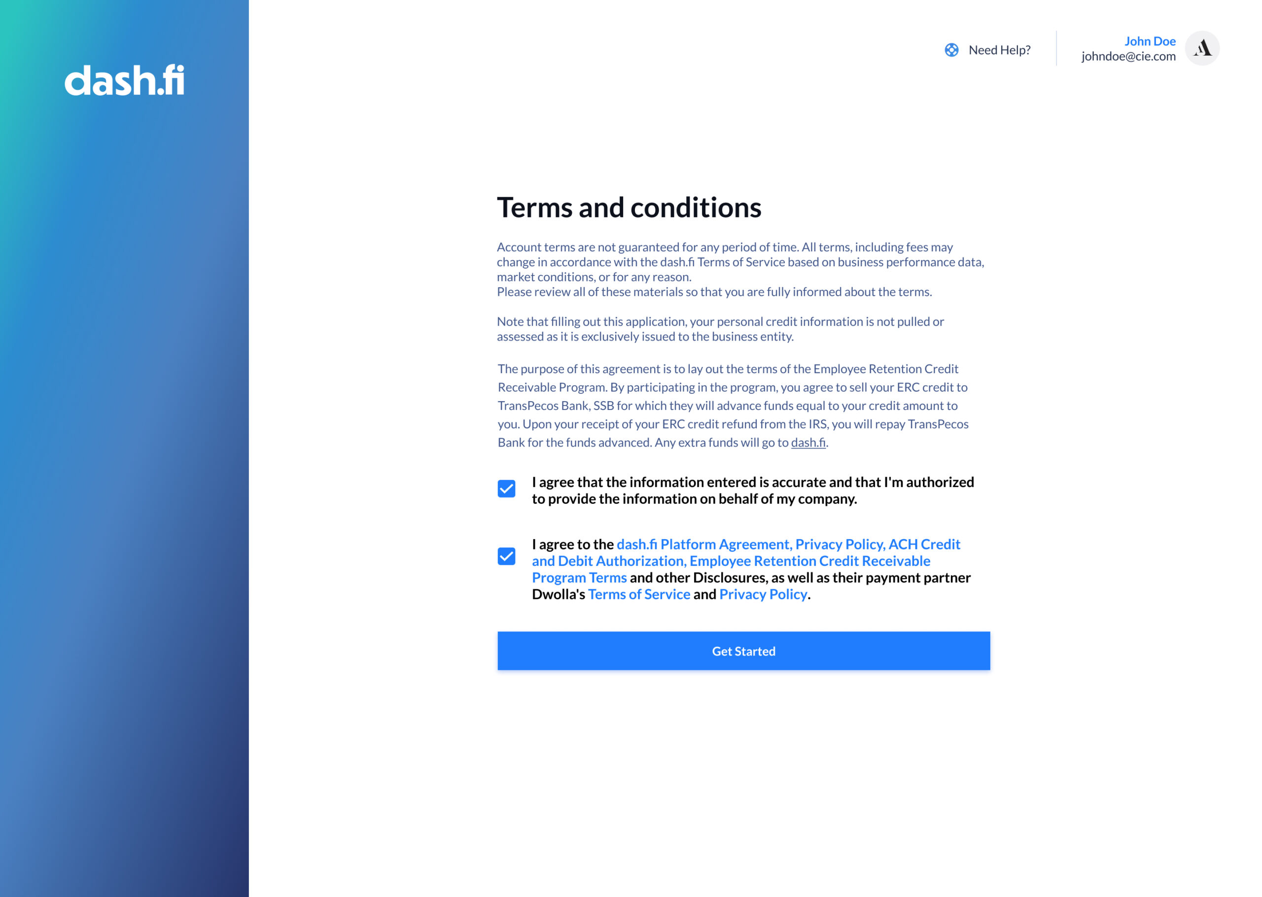
Security via UX: By embedding self-identification tools directly into the flow and integrating KYC with Maid, we reduced fraud by 90% while keeping the user experience feeling lightweight and modern.
Real-Time Status Transparency: Users were given clear, live updates on their application state. If an application became "stuck," the system triggered a specific message explaining why and how to resolve it, maintaining momentum toward completion.
6. Outcomes & Impact
The redesign transformed the onboarding flow from a critical business bottleneck into a high-performance growth engine. By optimizing the "Onboarding Friction Index" and prioritizing UI clarity, we successfully reduced the total time to open an account to less than five minute. This radical increase in velocity directly correlated with a 30% rise in total approved applications, as the 40% of users who previously abandoned the process due to its length were now able to complete it seamlessly. Furthermore, the strategic integration of self-identification tools and "Maid" verification resulted in a 90% reduction in fraudulent sign-ups, securing the platform without compromising the user experience. Operationally, the focus on proactive error handling and clear placeholders eliminated 80% of preventable support tickets, proving that a data-driven design approach can simultaneously improve user satisfaction and internal team efficiency.
8. Reflections & Learnings
This project reinforced a core fintech principle: UX clarity is a form of security. By focusing on removing "papercut" frictions, like vague error messages and redundant fields, we solved a 40% abandonment rate. The transition from a manual, high-friction process to a high-velocity engine proved that when a product respects a user’s time and provides clear guidance, it creates the trust necessary for a long-term financial relationship.