1. Introduction
Dash.fi provides high-limit charge cards specifically for digitally native businesses managing massive advertising budgets. In the hyper-competitive fintech landscape, the first 60 seconds of a user’s experience are the most critical for conversion. As the Lead Product Designer, I was tasked with re-engineering the onboarding flow to eliminate the friction of setting up new accounts. My goal was to take a complex, regulatory-heavy process and transform it into a seamless, sub-one-minute entry point that establishes trust and security immediately.
2. Problem & Business Context
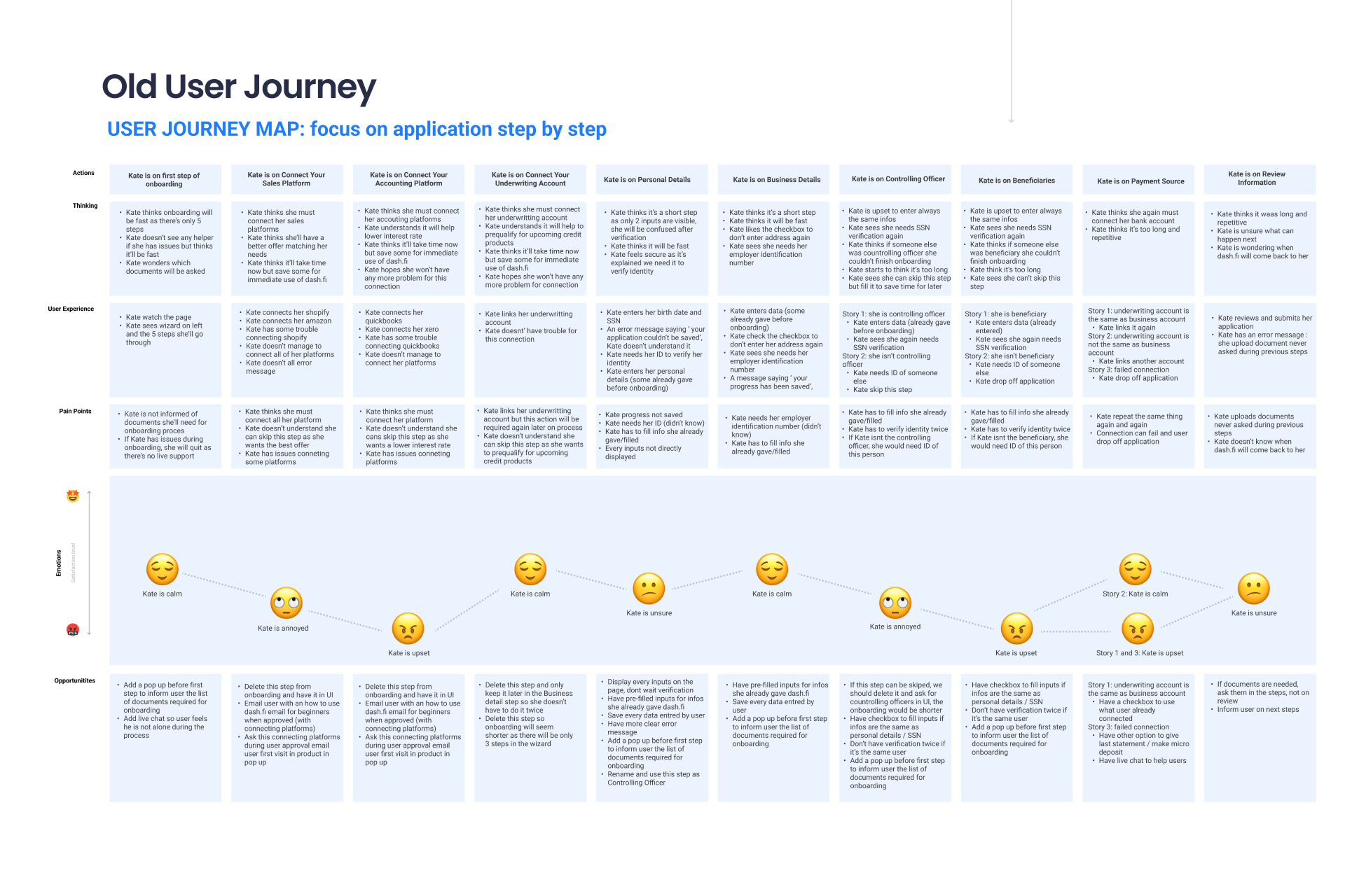
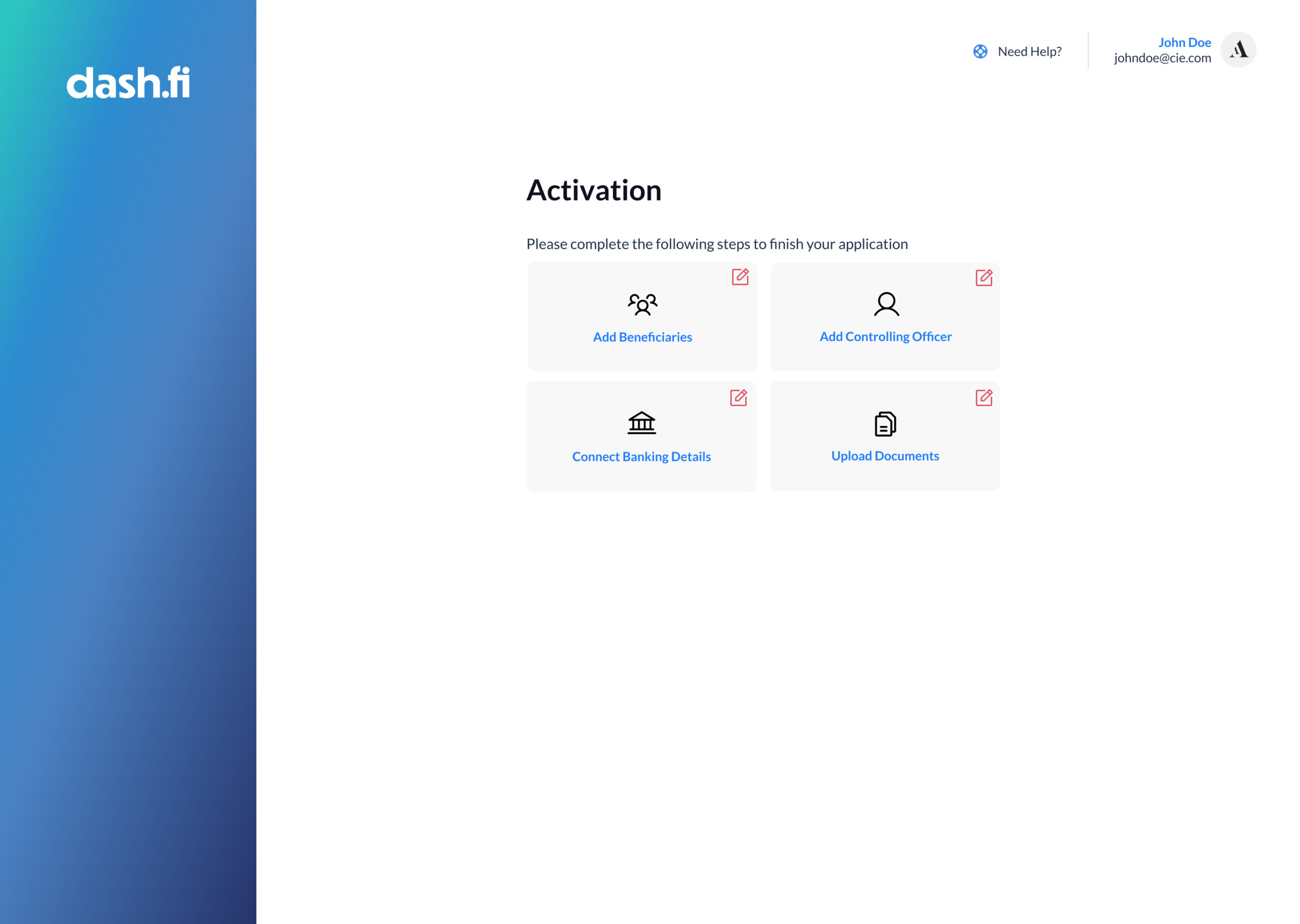
The business faced a major acquisition hurdle: 40% of users abandoned the onboarding process because it was perceived as too long or complex (around 25 minutes). From a product management standpoint, we had to balance several conflicting challenges: meeting strict KYC/KYB regulations, mitigating fraud, and identifying centralizing officers and beneficiaries—all while drastically shortening the "time-to-account." The core mission was to achieve the Lowest Onboarding Friction Index possible without compromising the high-security standards required for a financial product.
3. Research & Insights
Our discovery phase utilized Google Analytics, competitive benchmarks, and direct user interviews to quantify exactly where the funnel was leaking.
The "Support Gap": We discovered that 80% of support issues were preventable. They were caused by a lack of clear placeholders and helpful error messaging, leaving users feeling "stuck" and forcing them to abandon the app to seek help.
Competitive Analysis: We analyzed Ramp and Revolut. While Ramp excelled at interactive walkthroughs, Revolut’s ultra-short flow served as a warning: their lack of human support during technical bugs led to high user frustration.
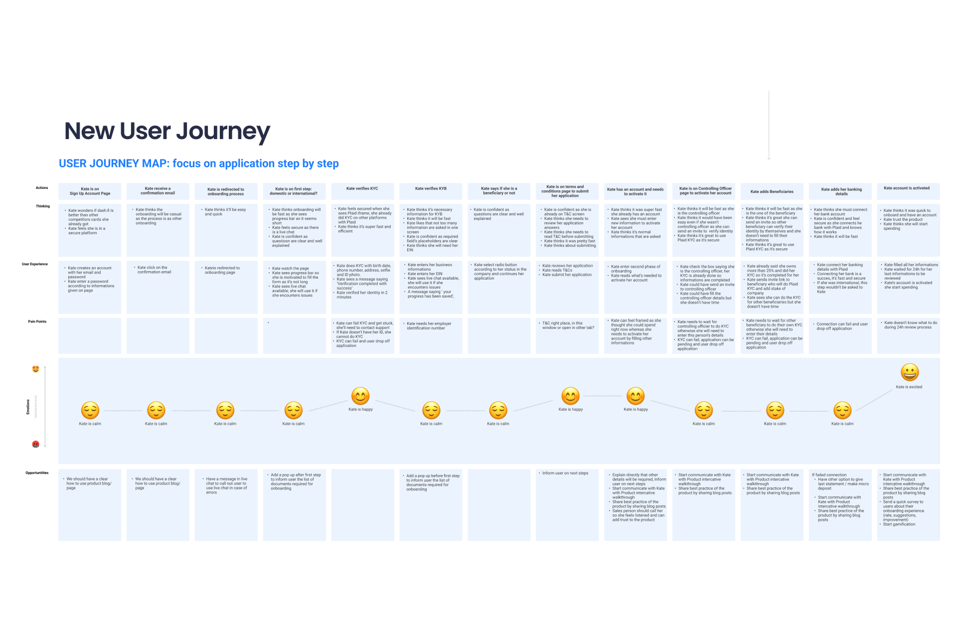
Velocity as a Metric: Our data showed that a 70% decrease in average onboarding time was the necessary threshold to move the needle on application completion and increase approved applications by 30%.
4. Design Strategy & Prioritization
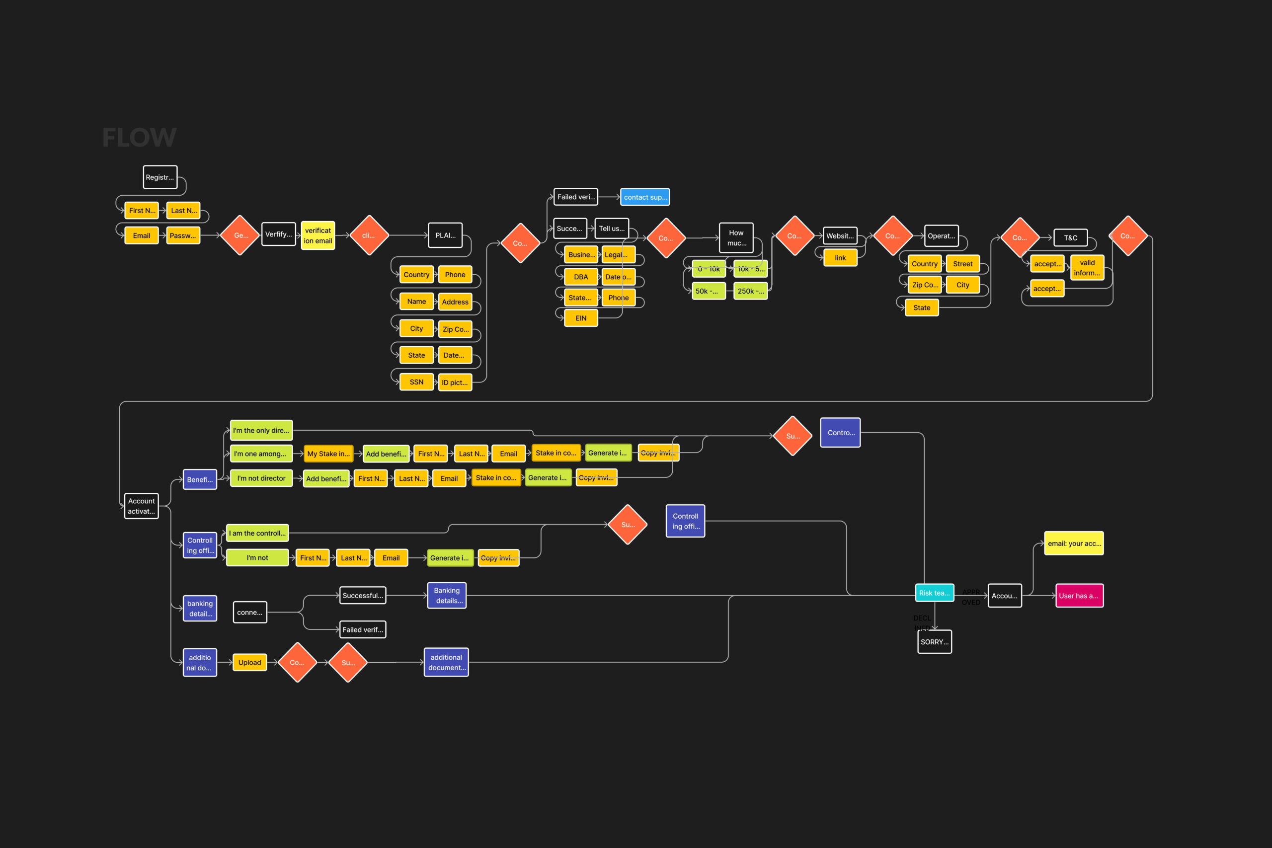
To manage the complexity of the "Zero to One" build, I used the Eisenhower Matrix to prioritize design efforts, moving away from a "one-size-fits-all" form to a logic-based journey.
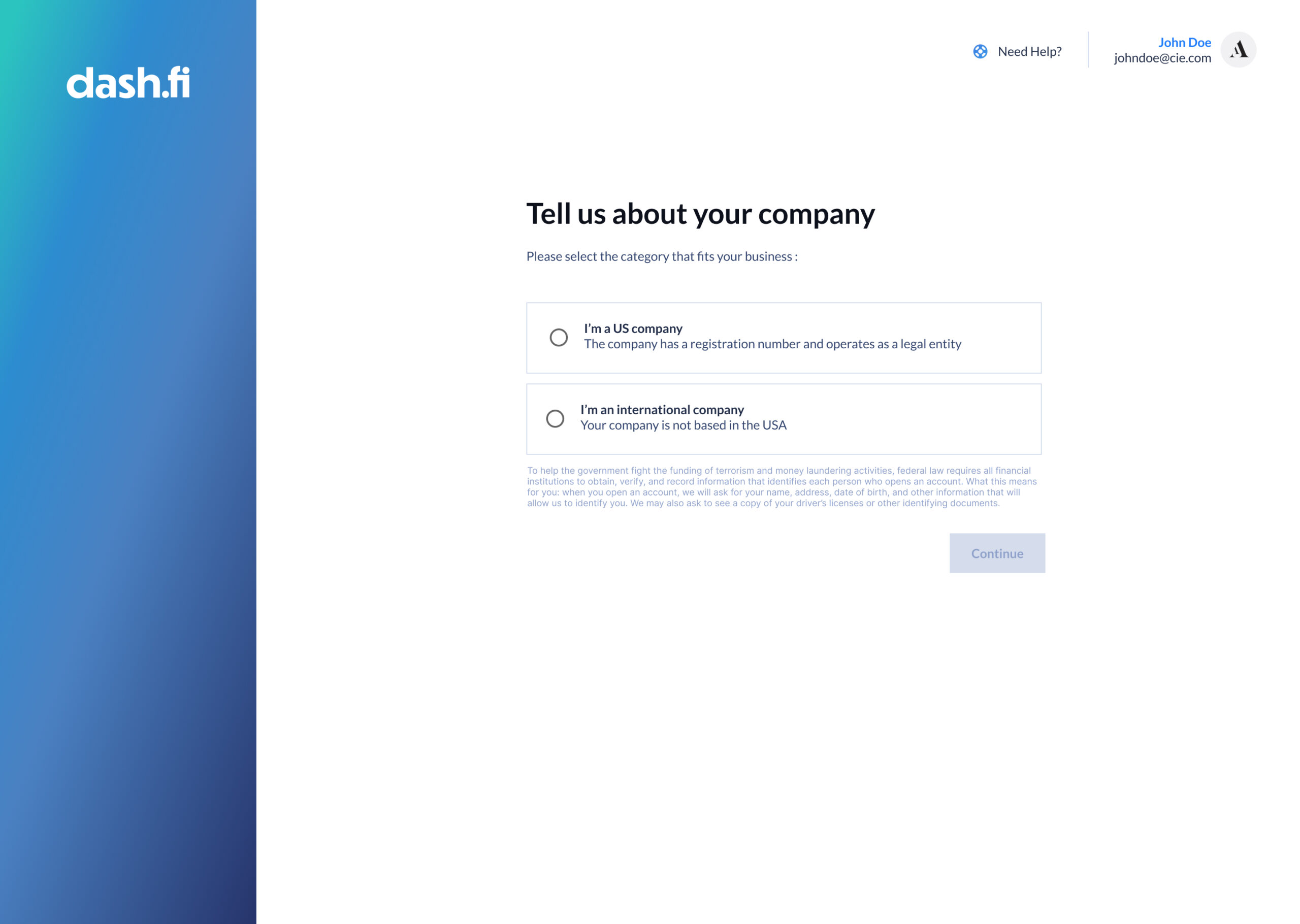
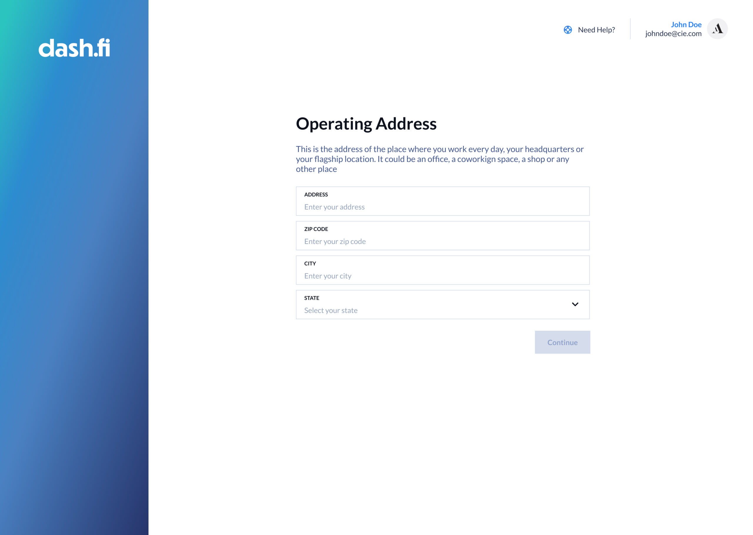
Smart Routing Architecture: I designed a system that identifies Domestic vs. International users at the very first step. This ensures users are only prompted for the specific documentation they need, preventing the cognitive overload and "form fatigue" that caused previous drop-offs.
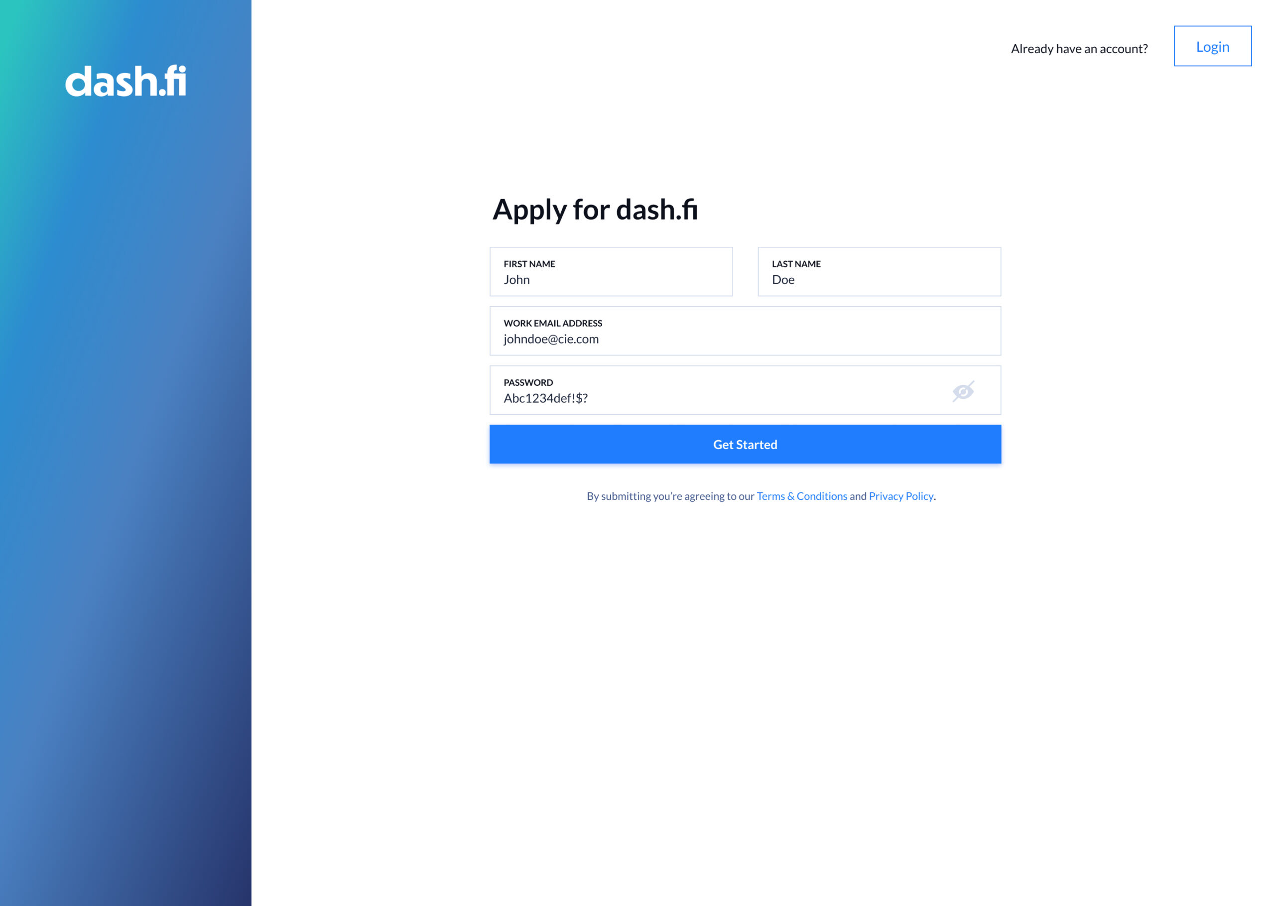
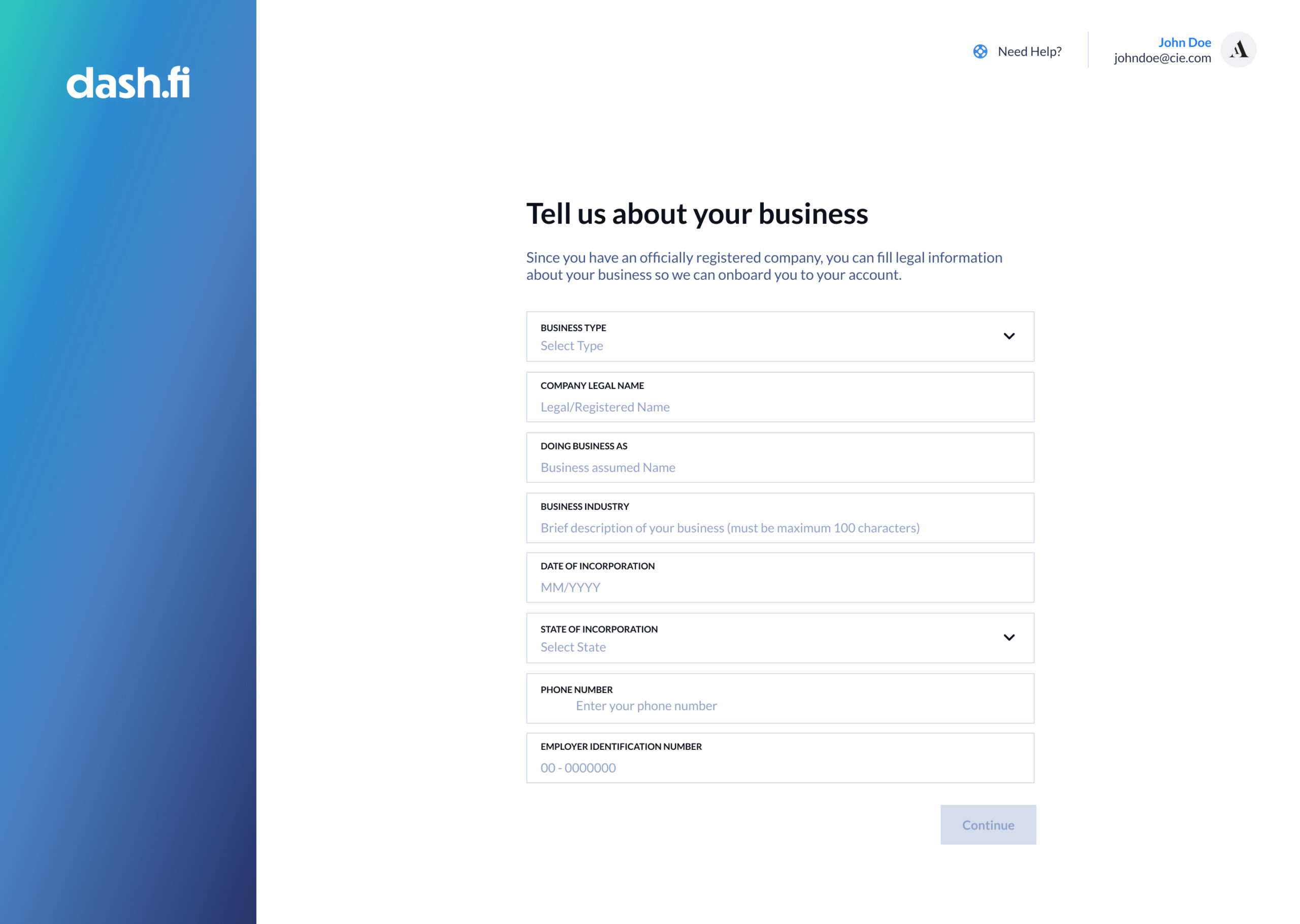
Designing for Failure (Placeholders & Microcopy): Knowing that 80% of support tickets came from user error, I revamped the data-entry UX. We implemented Contextual Placeholders that show users exactly what data is needed (e.g., specific EIN formats) before they type, rather than waiting for them to fail.
Always-Available Support: Learning from Revolut’s mistakes, I ensured that a Human-in-the-Loop support trigger was always accessible. If a user spends too much time on a single field, the system proactively offers assistance, ensuring no user is left "stuck."